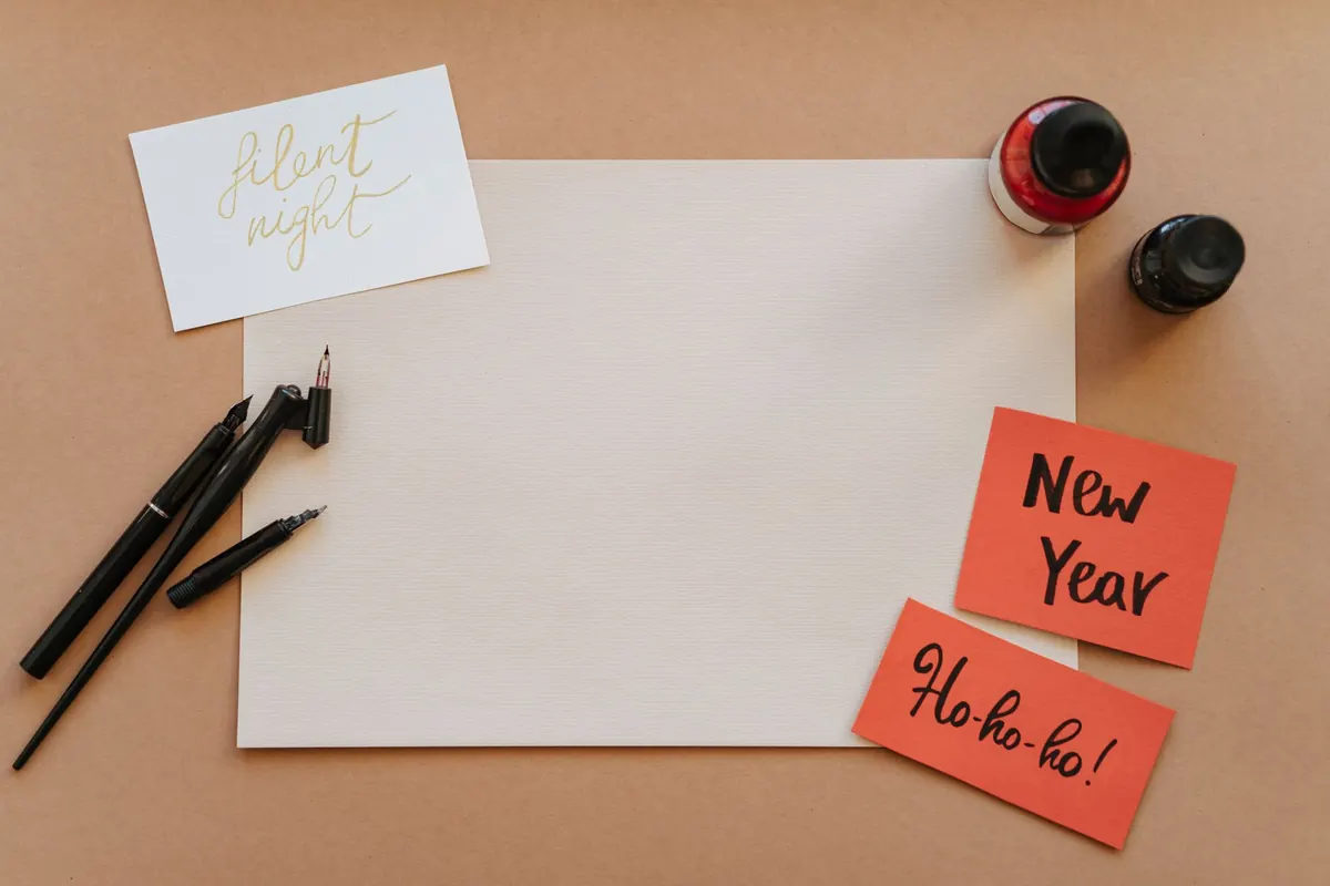
Pointed-pen calligraphy looks like a gift. In practice it is a set of small physical habits, and almost every letter in a modern script — Copperplate, Spencerian or one of the looser contemporary hands — is built from the same handful of movements. Six of them, in fact. Learn those six properly and the alphabet stops being a puzzle you solve letter by letter and becomes something you assemble.
You do not need much kit, but you do need the right kit.
Draw your own guidelines: a baseline, an x-height line about 5 mm above it, an ascender line, a descender line, and slant lines at roughly 55 degrees from the horizontal. Faint guidelines cause drifting slant, so redraw them each session.
Sit square to the desk, angle the paper, and let the pen shaft point up and away from the writing line at about 45 degrees, with both tines resting flat on the page.
Work through these in order. Each is a movement rather than a shape to copy, and each appears in dozens of letters.
Pull the nib towards you along a slant line, adding pressure through the middle of the stroke and easing off before the end. The stem should be thickest at its centre. This stroke carries the weight of a page and forms the main stems of 'i', 'm', 'n', 'p' and 'h'.
Push the nib away with no pressure at all, letting the tines close into a single fine line. Hairlines do the joining and give the script its lightness, so treat them as an exercise in restraint: steady speed, even thickness, no pressure at the ends.
An upstroke that climbs from the baseline, curves to the right at the top and descends as a short downstroke. It makes the arch of 'n' and 'm' and the shoulder of 'h'. Think of an egg lying on its side rather than a semicircle — narrower at the top, fuller at the base.
A downstroke that curves right at the foot and lifts away as a hairline. It gives you the bowl of 'u' and 'w'. The pressure belongs to the turn itself; release as the nib comes back up.
An overturn and an underturn joined without a break, so the pen travels down, round, up, over and down again. You will find it in 's', 'e' and any letter that reverses direction. This is where rhythm usually breaks, because pressure has to come off and go back on within a single movement. Slow down at the change and keep the two halves equal in size.
Draw it as one anticlockwise movement: shade the descending left side, release at the base, return as a hairline up the right, and close the shape at the top. The oval underpins 'o', 'a', 'd', 'g' and 'q', and its proportions set the width of most of the script. It leans with your guidelines rather than standing upright.
Warm up before you write anything you care about. Five minutes of drilling will do more for your hand than half an hour of copying words you cannot yet form well.
A week of this daily will not make you neat. It will make you consistent, which is what neatness is built on.
When you can fill half a page with downstrokes of even width and slant, start building letters. Take them roughly in order of difficulty: 'i' and 'l' first, then 'n' and 'm' from overturns, then 'u' and 'w' from underturns, then 'o' and 'a' from ovals. The traditional first word is 'minimum', and it makes a good test — nothing but downstrokes and overturns, so any mismatch in the arches shows up at once.
Hold off on capitals and flourishes. Form first, then speed, then style.
Short, regular sessions beat long, occasional ones. Fifteen minutes a day, five days a week, will move your hand further than one two-hour marathon on Sunday.
Keep every sheet, dated, in a folder, and note the nib, ink, paper and x-height at the top. When a stroke suddenly behaves, you will want to know what changed; when a session goes badly, a month of dated pages shows it was one bad day rather than lost ground. Comparing your first page with your thirtieth tells you more than any compliment.
Photo: olia danilevich / Pexels
A practical, printable checklist for a journalling weekend away, covering notebooks, pens, ink, washi tape and the...
Grain direction decides whether paper folds cleanly or cracks, tears straight or ragged, and whether a bound book...
Hardcover and softcover journals compared on construction, durability, portability and writing comfort, with...

A journal for paper, ink, and craft.
